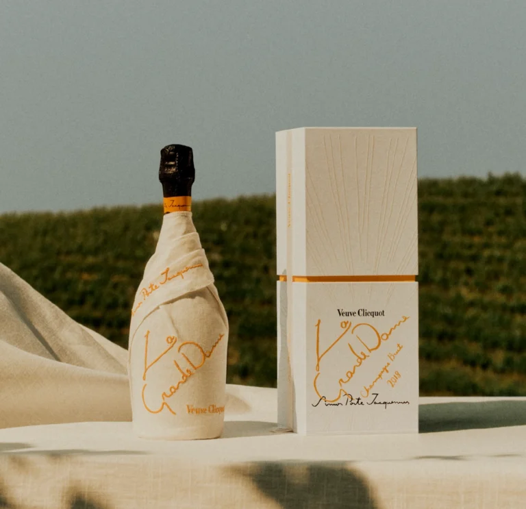
Picture a conference room somewhere inside Moët Hennessy where Sanjana Chatlani had been working as a marketing assistant since 2015 — fluorescent lights, a marketing deck nobody's fully watching, the low hum of a Tuesday that won't be remembered. Except in the corner, someone has set up an easel and is turning a name into art with nothing but ink and patience. Everyone else drifts back to their laptops. Sanjana doesn't. She's just watched a stranger with a dip pen make calligraphy look less like a party trick and more like a whole way of being, and something inside her shifts.
Ink before ambition
Sanjana wasn't planning a career change. But she went home that evening and picked up a pen anyway, tracing out the same few letters over and over, just to see if she could make them beautiful. And did it again the next day, and the one after that. By 2017, three hours of practice most evenings after work, plus a handful of hand-lettered Diwali and wedding cards for friends and family, had become enough of a body of work that she needed somewhere to put it, so she opened an Instagram account — and promptly got stuck on the one thing that should have been easy: what to name it. "I wanted something in the name to give out what it is that I do," she says, which ruled out calligraphy for being too technical, too niche, and nudged her toward lettering instead, broader and friendlier, with more room to grow into. Calling it Bombay was an easy choice as she says, "I've been born and brought up in Bombay... that's my home, that's what I identify with." Company came last — a hedge, in case the hobby ever grew into something bigger.
That future kept her waiting too. It took another full year, until 2018, before actual paying clients showed up and the word ‘Company’ finally meant something real.
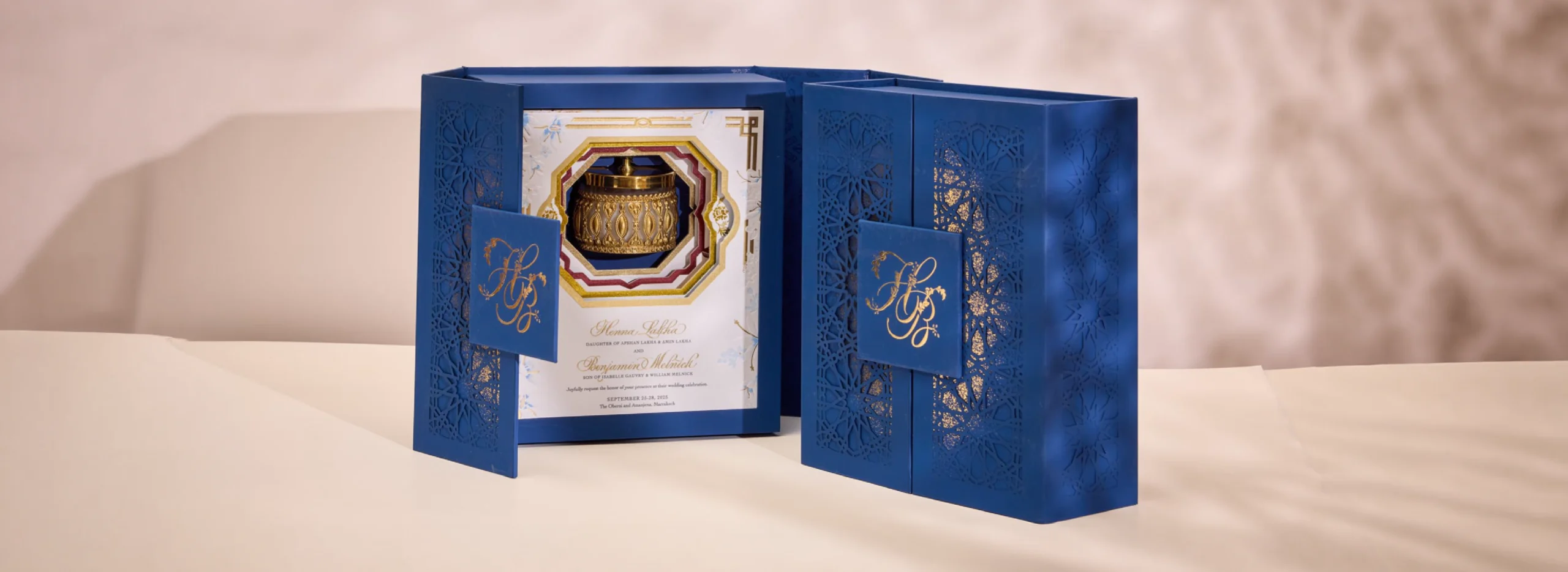
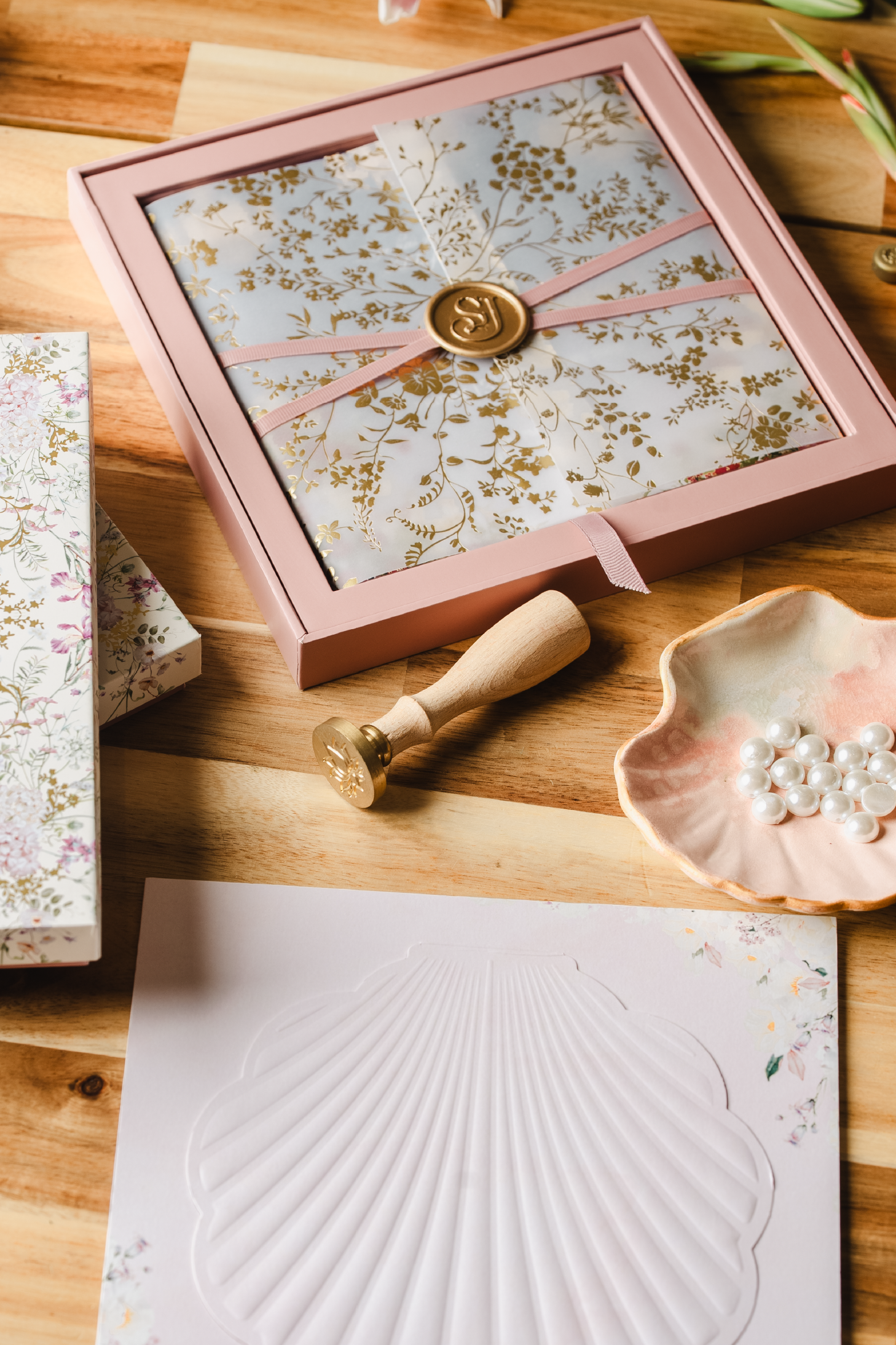
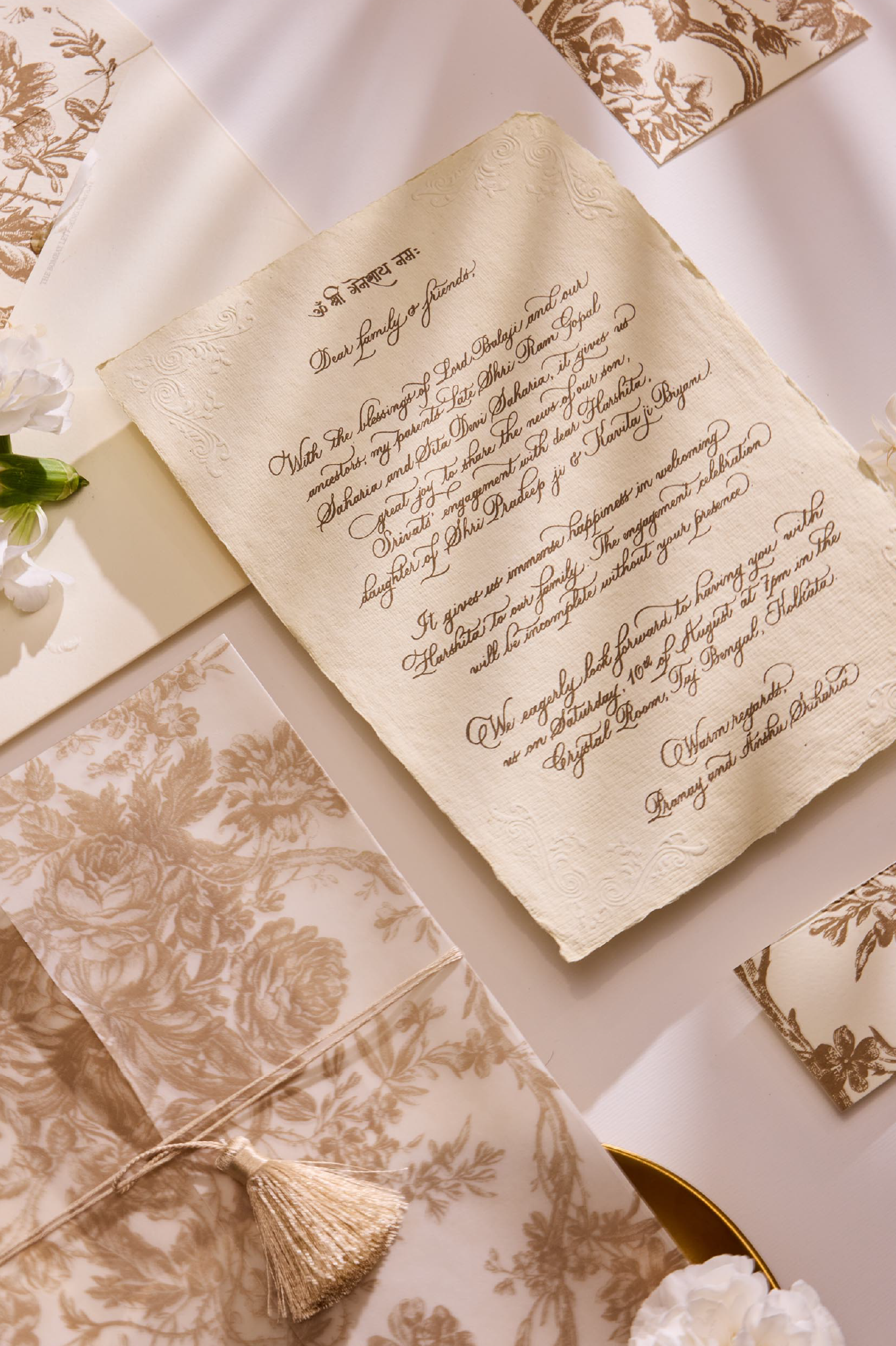
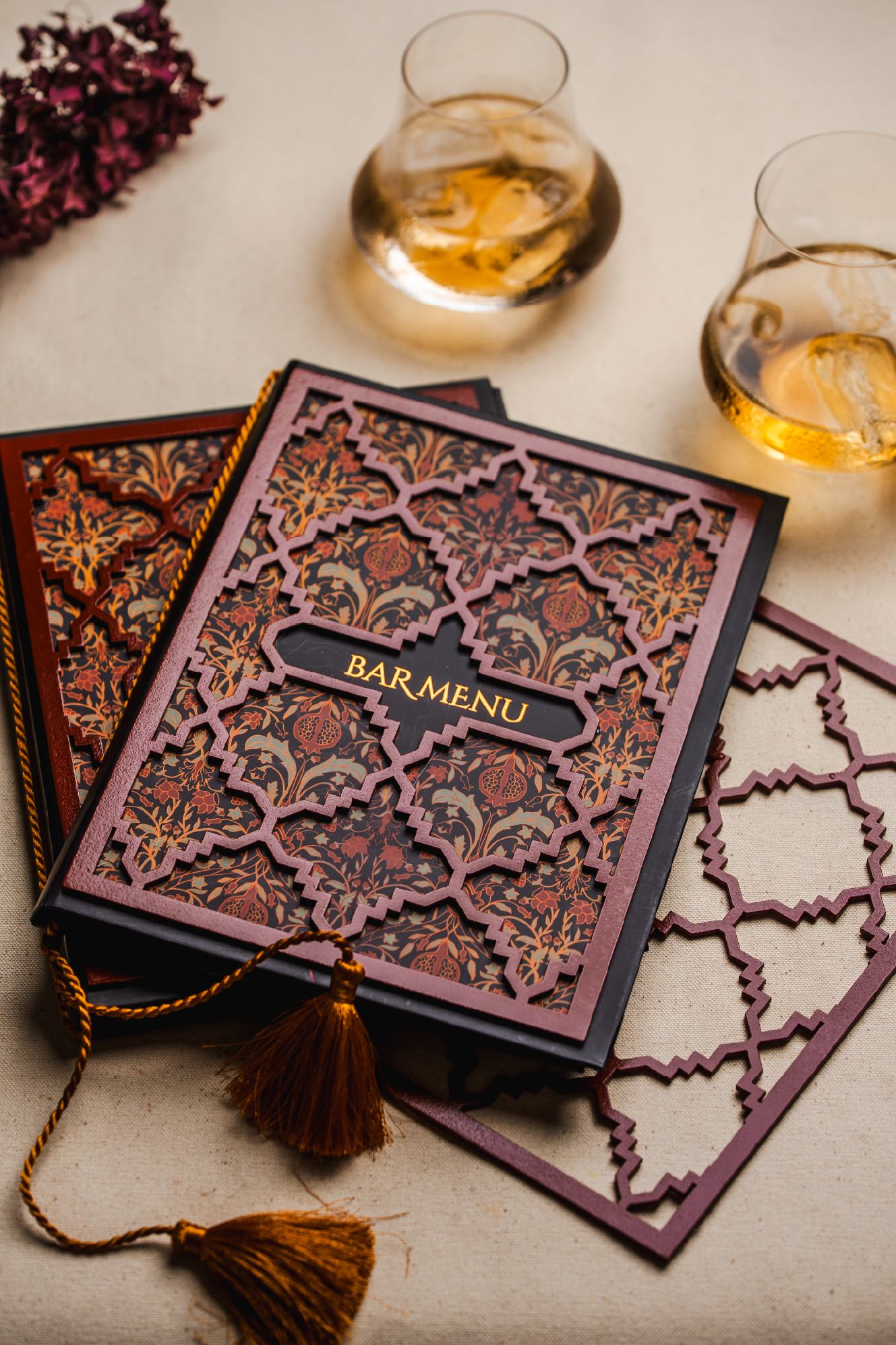
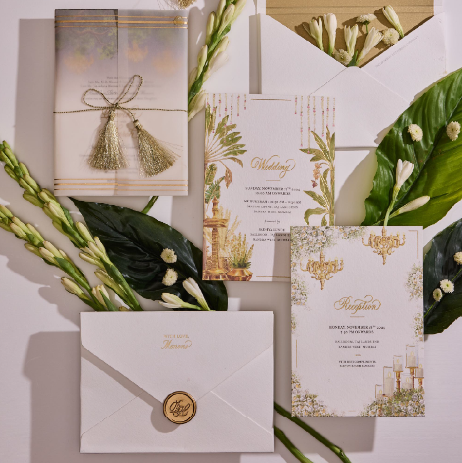
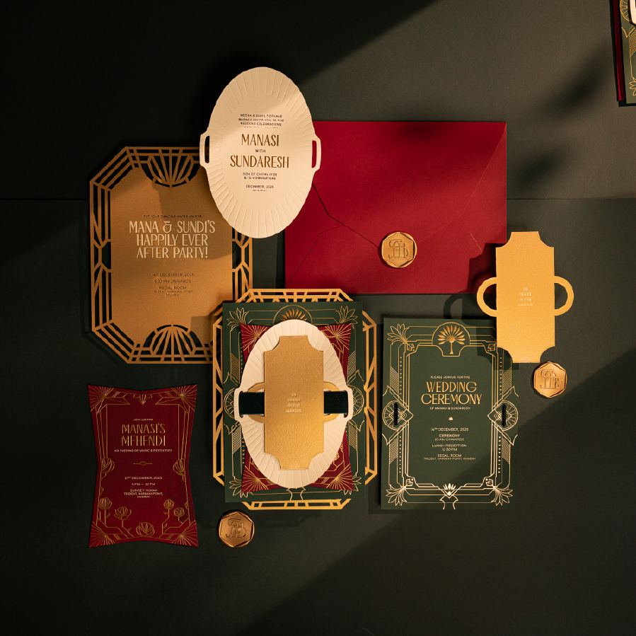
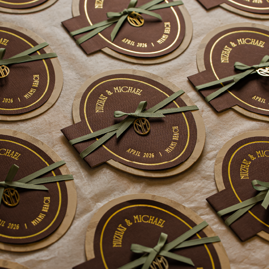
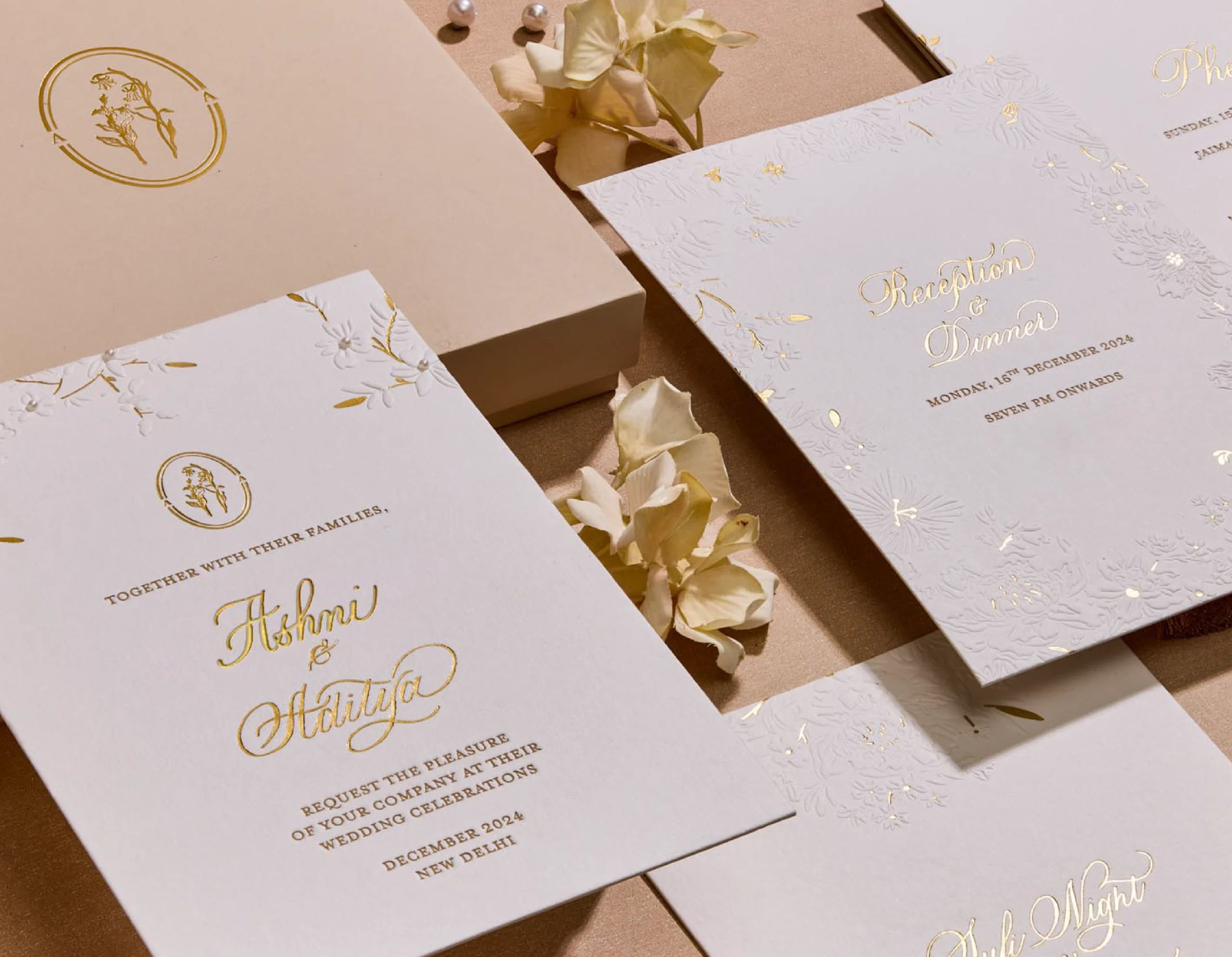
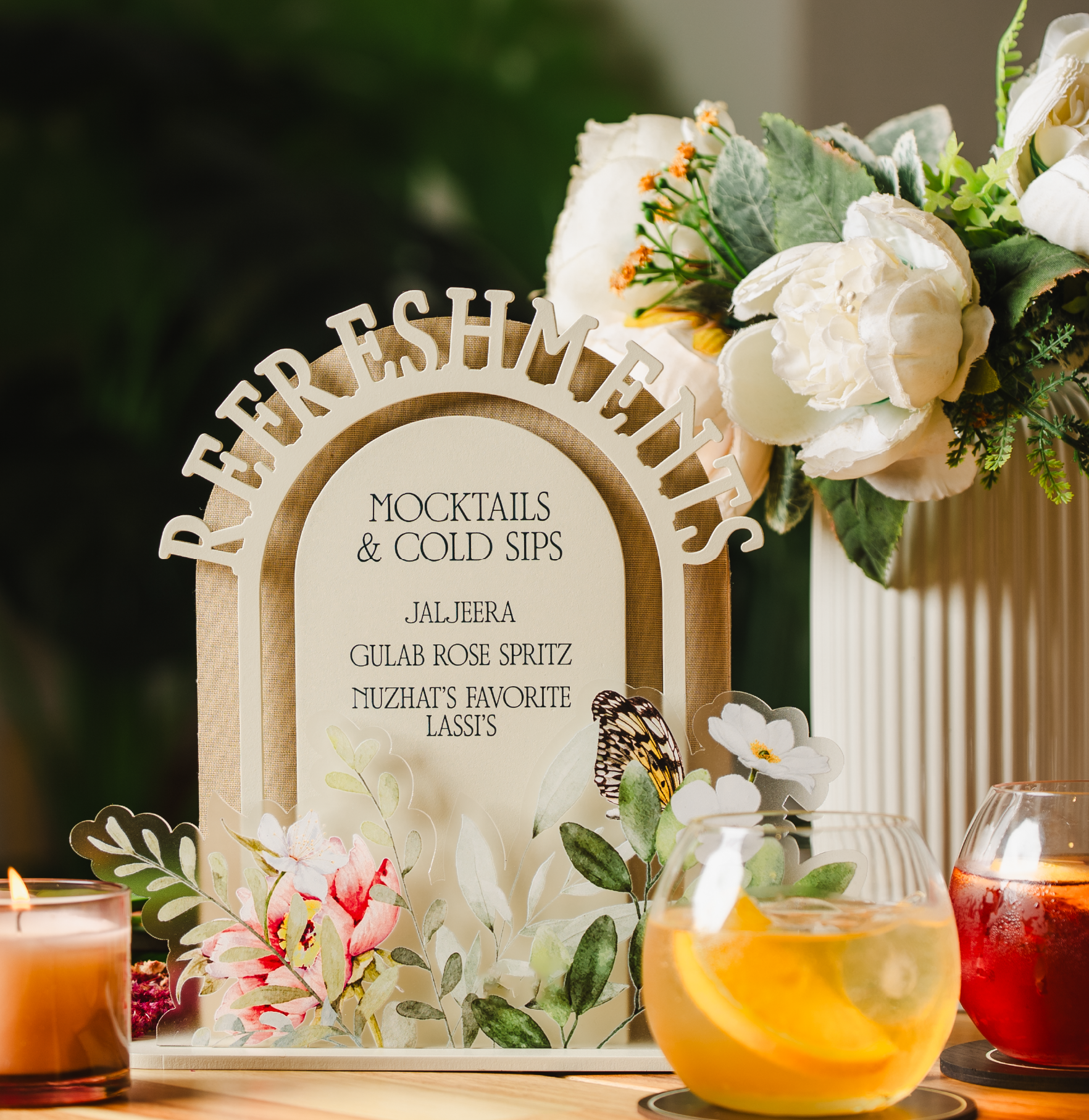
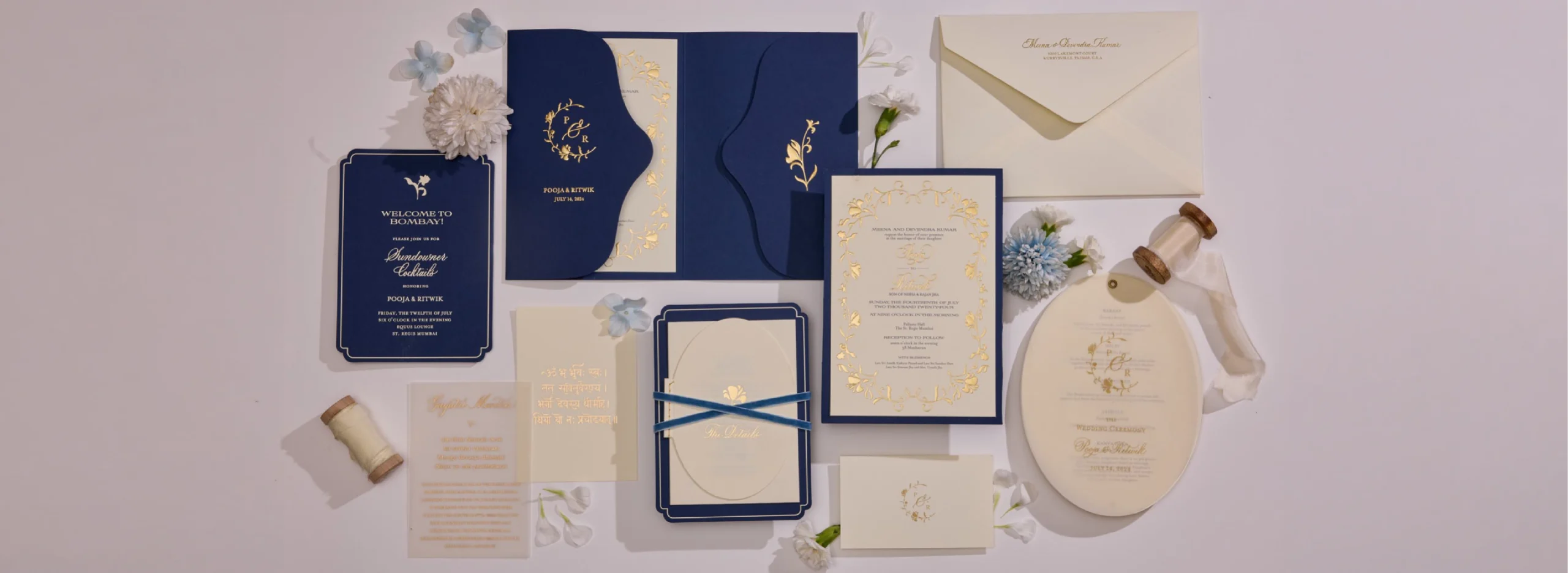
For a couple of years it stayed a solo act, just Sanjana, one assistant, and a fairly single-minded obsession with letterforms. Then her clients started nudging her sideways. “We love your aesthetic,” they'd say, “can you also design our cards, can you also handle the print and production?” It felt like an invitation, not a demand, one she said yes to right away, and in no time the calligraphy studio turned into a design house.
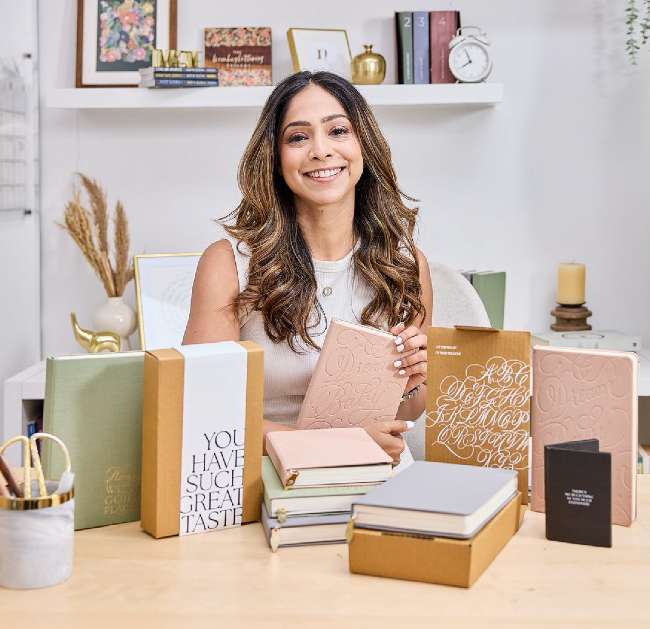
These days the business runs on three engines that are rarely idle at the same time: the studio, taking on weddings, corporate identity and packaging with agency-level polish; the store, her own product line of planners and stationery, where for once nobody's taste gets a vote but hers; and the classroom, where she teaches — Copperplate, brush lettering, flourishing — because a love this big deserves an audience.
It's a strange time to be building a business around handwriting. Fonts are a click away, software can now mimic what once took years to learn by hand, and most people barely write anything at all anymore. For Sanjana, it makes handwriting feel more precious, not less relevant. Her pen hasn't gone anywhere; if anything, it's become the rarer, more deliberate choice.
A blend of both worlds
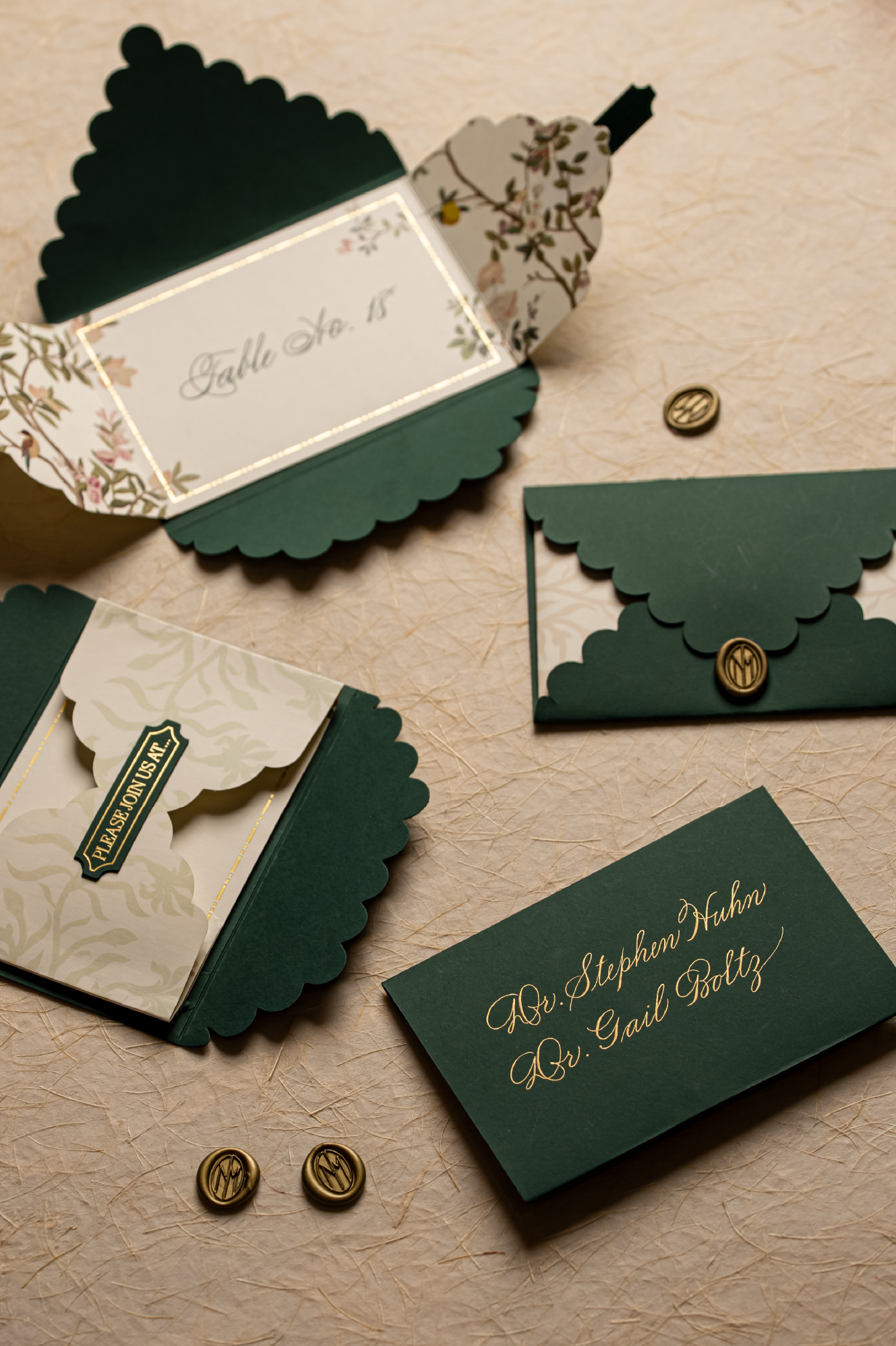
Calligraphy, as Sanjana practices it, is a family of scripts, each with its own rules and rhythm, from the looser, older Spencerian hand to brush lettering's entirely different tool and motion. But her own training has two distinct personalities so to speak. There's Western Copperplate — delicate, whimsical, thoroughly old-world, written with a pointed pen and controlled entirely by hand pressure, the style she's best known for — and there's Devanagari, rooted in Sanskrit, with a completely different toolkit and rule book. Getting the two to speak to each other inside a single piece has become her current fixation, and she talks about it with the unguarded enthusiasm of someone still a little starstruck by her own craft. "I'm super fascinated by that," she says, "It's something I've been studying to see what I can do with it."
Ask her which commission she's proudest of, and she skips right past the glossiest wedding in her portfolio. She goes straight for a commission a mother once asked for: a wooden box with twenty-six handwritten cards, one for every letter of the alphabet, each paired with a word and a small life lesson for her newborn to grow into. Years later, that same mother wrote back just to say the box still lives in her son's room, and still gets opened. Which is really the whole point. "It's cherished so much more," Sanjana says of handwritten work, and buried in that one line is essentially her entire philosophy: that care, more than perfection, is what makes something feel like a luxury.
That philosophy gets tested very differently depending on who's sitting across the table. Global brands arrive in full armour with guidelines for everything, every flourish pre-cleared before it's even drawn. Weddings arrive messier and far more human, and she's just as likely to be fielding notes from a groom's grandmother as from the couple actually footing the bill. It's taught her, sometimes the hard way, exactly when to hold her ground, and when to just say, "I'm not the girl for this job."