A ship knows where it is going by reading the coordinates around it. An art gallery, perhaps, works in much the same way as it offers a point of departure while leaving the rest of the journey open to interpretation.
That was the thinking behind Latitude 28’s new home in Delhi’s Defence Colony. When interior designer Tushant Bansal first walked into the space, there was little to suggest what it would become: just four bare walls and a PCC floor. What followed was a four-month transformation, shaped by an idea borrowed from navigation and translated into architecture. Aluminium doors, converging perspectives, a reflective white floor and carefully placed flashes of red now give the gallery the feeling of a vessel in motion — one designed to change course with every exhibition.
The freedom of a blank shell
The brief, at least on paper, was remarkably simple. Founder Bhavna Kakar asked Tushant to make the gallery as optimised as possible and left the design direction entirely to him. With no elaborate aesthetic prescription to work around, the empty shell became an opportunity to think about what an art space could feel like, rather than simply what it needed to contain.
The renovation took place over four months and the absence of an existing design language offered Tushant a unique kind of freedom. “Every space comes with its own limitations but that doesn’t define a project,” he says. “We took every single constraint, as some may like to call it, as a challenge.”
The contractor’s team at JJ Interiors helped bring that vision to life, working alongside Tushant to transform the raw shell into a gallery that could accommodate both the practical demands of exhibiting art and the more elusive quality he was after — movement.
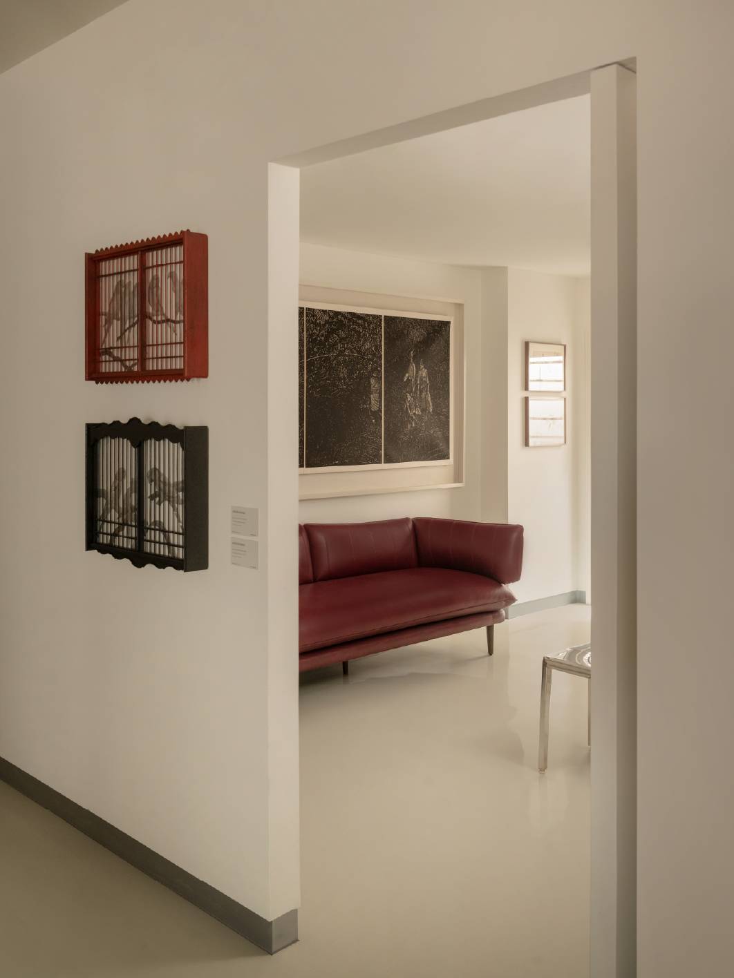
Framed artworks punctuate the pared-back interiors, adding colour and texture to the otherwise restrained palette
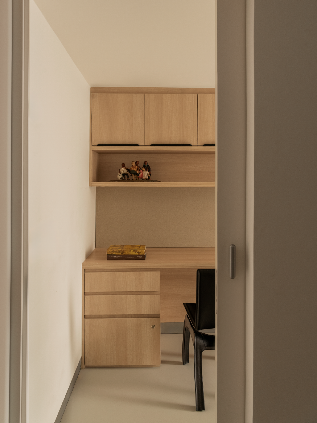
Timber cabinetry and open shelving introduce warmth within the gallery’s otherwise restrained material palette
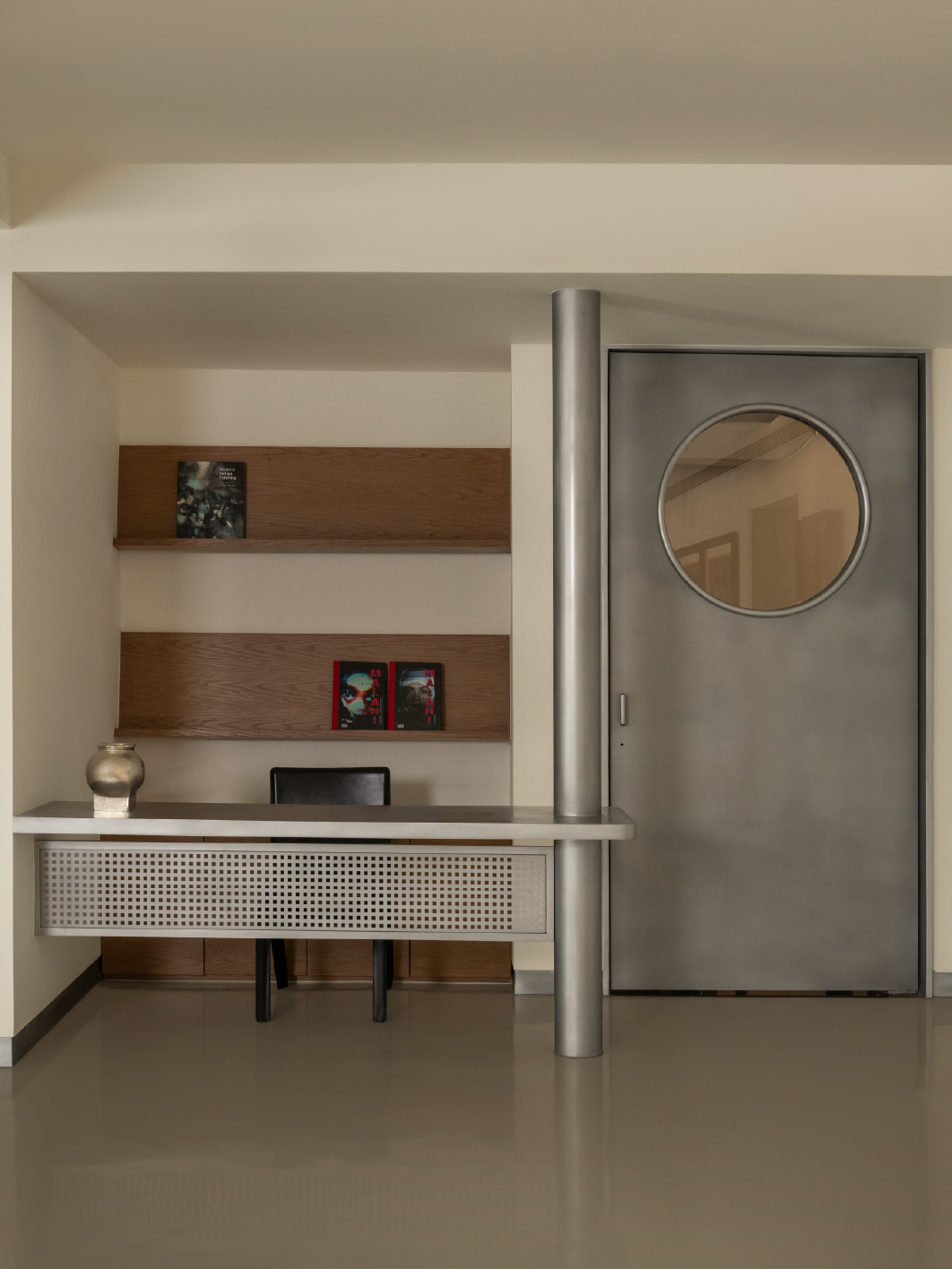
Aluminium, timber and clean-lined cabinetry bring together the gallery’s industrial and pared-back design language
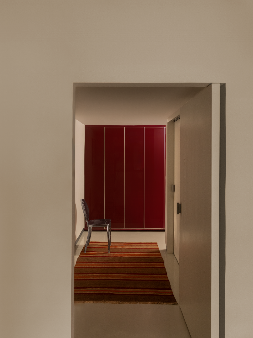
A richly coloured red wall adds a bold visual moment to the gallery's otherwise muted interiors
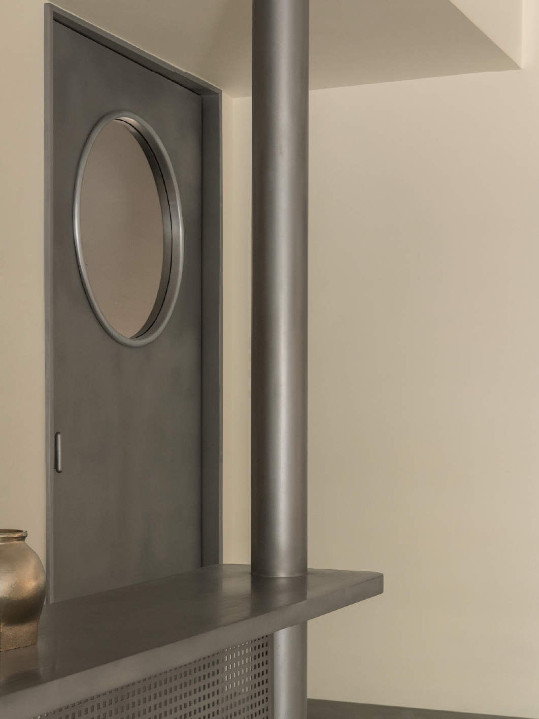
An aluminium door with a circular window draws on the streamlined, vessel-like quality that runs through the gallery’s design
The coordinates of creativity
For Tushant, the answer was already hiding in the gallery’s name. Its origins in Delhi, and the nautical idea behind its name, offered a natural starting point: the notion of navigation, movement and discovery, translated into the language of the interiors. “The idea for Latitude 28 actually came from how ships use latitudes to navigate — I loved that sense of direction and exploration, and it felt like a perfect metaphor for an art space,” he says.
A good exhibition rarely takes you from A to B. Instead, it nudges you sideways, changes your perspective and occasionally leaves you wondering where, exactly, you have landed. Tushant saw a parallel in the way we move through art and creativity, constantly searching for direction and meaning, and wanted the space to hold onto that feeling of journey and discovery. The ship became less a literal reference and more a starting point — a way of thinking about how a visitor might move through the gallery.
Where the lines lead
The interiors borrow from ships, but stop short of becoming overtly nautical. Aluminium doors bring a streamlined, industrial quality to the space, while a converging window creates a shifting perspective, subtly drawing the eye inward and giving the gallery a greater sense of depth. There are quiet Art Deco influences too, bringing geometry and polish to the otherwise pared-back interiors. Nothing feels overly decorative; instead, the details reveal themselves gradually as you move through the space.
The gallery’s relatively low ceilings presented another consideration. Tushant looked down rather than up, using a white epoxy floor to create a sense of openness. Its seamless, reflective surface catches the light and allows it to travel across the room, while its industrial quality reinforces the vessel-like atmosphere.
Then comes the red — a deliberate interruption. Against the monochrome palette, it feels almost like a visual marker, injecting a little energy into an otherwise controlled environment. “Touches of red break away from a purely monochrome palette and give the space a sense of energy and playfulness,” says Tushant. Together, these elements create a space that feels sleek but not sterile, directional without being prescriptive. The architecture gives visitors cues about where to look and how to move, while leaving enough room for the artwork to take over.
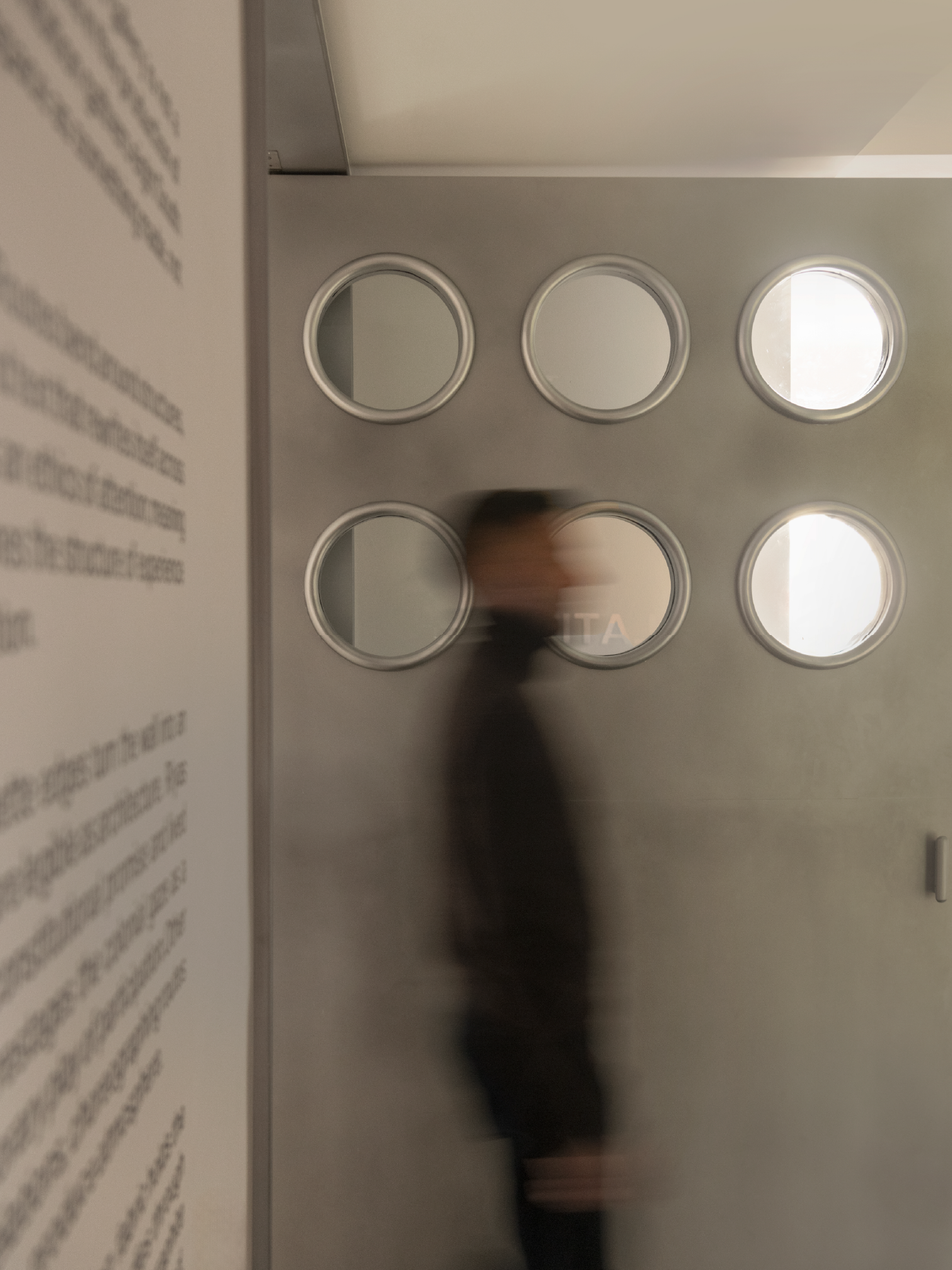
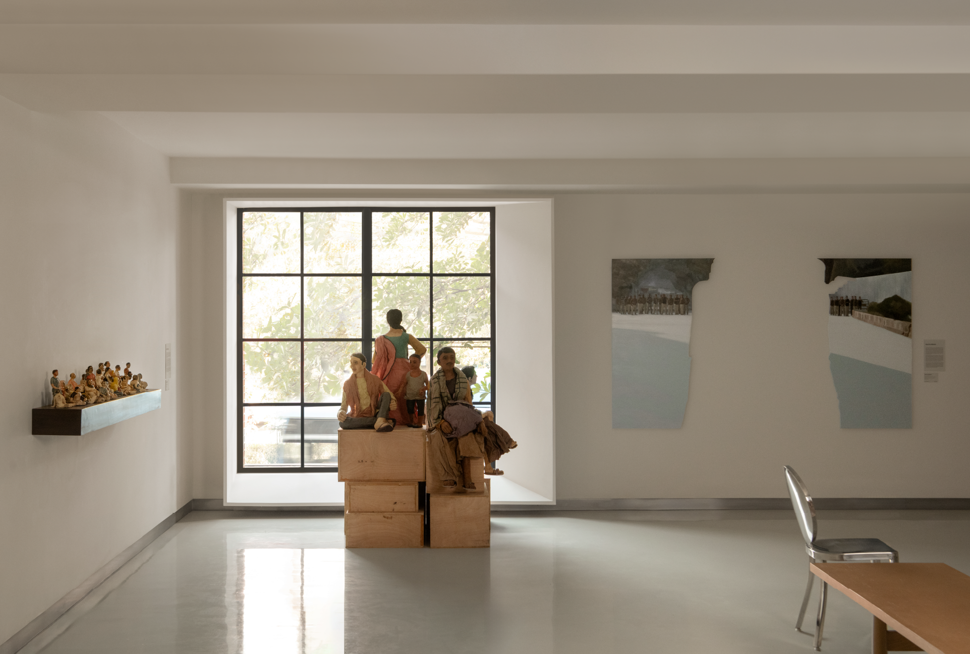
Where art meets architecture Artworks and sculptural pieces occupy the light-filled gallery, where the architecture is designed to shift with each exhibition
No fixed course
The real test of a gallery interior, however, is what happens when the art arrives. Latitude 28 was never intended to look exactly the same twice. Its architecture has enough character to make an impression, but enough restraint to allow each exhibition to take possession of the space. The white floor, clean surfaces and directional lines become a framework that can be continually rewritten.
“It’s actually interesting to see how the gallery space entirely changes with each show,” Tushant says. “Every time I go back, the space looks completely new and different from what it was in the previous show.” That ability to shapeshift is perhaps its most compelling design feature. A new installation can alter the rhythm of the room, a different arrangement can change its sense of scale, artwork can interrupt the lines and perspectives that define the architecture. For Tushant, that adaptability is also what makes each project worth approaching differently. “Every project is unique and demands a completely different response,” he says. At Latitude 28, that meant creating an identity with enough character to be memorable, yet enough flexibility to evolve with the art. Perhaps that is where the design finds its most fitting expression: not in a space with a fixed destination, but one that leaves room for discovery. “The gallery feels a bit like being inside a vessel — sleek, directional and always in motion — inviting visitors to explore, drift a little, and maybe find their own latitude along the way.”
For a space devoted to art, perhaps the most interesting destination is the one that keeps changing.